top of page
Nina Ramondo
SPRING | 2020
typE DESIGN II
TYPE INSPIRED NEWSPAPER
JUNIOR YEAR WORK
Instructor - Pedro Mendes, SVA
Choosing the architect's lifestyle as the motivation for the design. I carefully selected the typeface, Robota. The letter structure created a modular look which I then based the layout on.


FALL | 2019
Experimental
typography
TYPE DESIGN
JUNIOR YEAR WORK
Instructor - Olga Methleskia, SVA
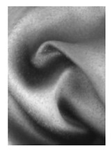
I was given the task of capturing natural texture from everyday life. Where contrast is evident and form is organic. Then meticulously study through a selection of fonts that could play the best role as the brush and to paint, or in this case typeset the best replication of the image. Defining its natural contrast in grayscale.


SILK ROSE
Minion Pro
Font by Robert Slimbach
Published by Adobe
Bulmer MT
Font Credit - Morris Benton Published by Monotype

Avenir Next
Font Credit - Adrian Frutiger and Akira Kobayashi Published by Linotype

Spring | 2018
Basic Type I
TYPOGRAPHY BOOK
SOPHOMORE YEAR WORK
Instructor - Richard Mehl, SVA
PARASOL
This project was to create a full type family and handcraft a typeface book to show the work.
The concept for my typeface design is based on the different sections of the rainforest. The book was designed to bring awareness to the rainforest and how precious it is.


SPRING | 2016
typography


TYPOGRAPHY
FRESHMAN YEAR WORK
Instructor - Kristin Derimanova, KBCC
2016 Award Winner
Gallery Award in Typography
Kingsborough Community College
I was inspired by Fernand Leger's series of paintings called Contrast of Forms. I crafted each letter differently with elements replicated from various paintings in the series. My aim was to create each letter where the structure was shared between elements and their base.
See MOTION for more about his work

bottom of page